

Softies
We unified Softies' brand experience with fresh creative and design, taking it from an outdated site to a high-converting ecommerce presence.
88%increase in revenue
22%increase in average order value
Brand Strategy & Identity
Every brand we build starts with research into your market, your competitors and your customers. What comes out is an identity designed to earn trust, stay consistent as you scale and turn recognition into revenue. Every brand on this page is a real client, and each one lists exactly what we made.
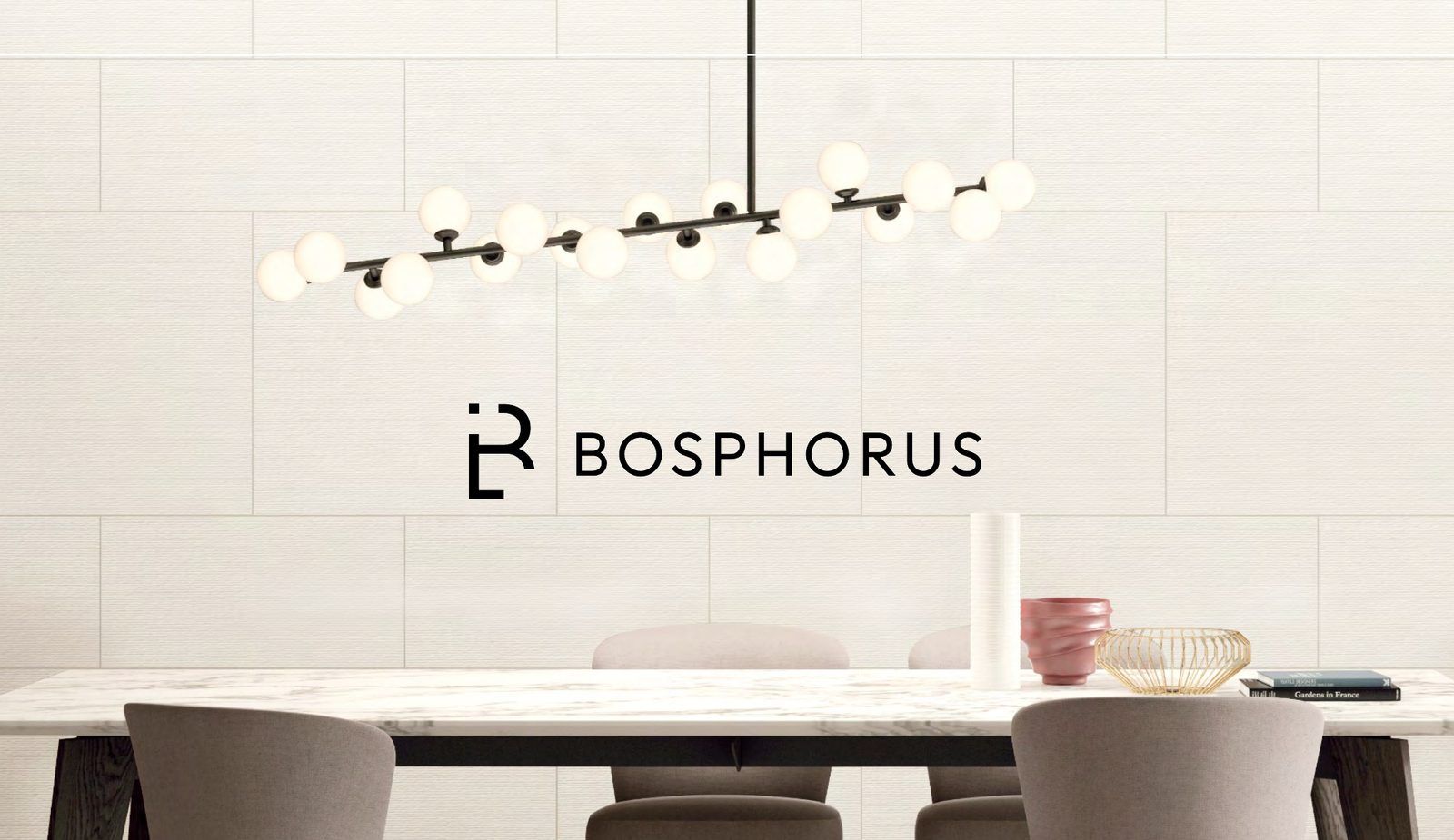 Bosphorus showroom wall
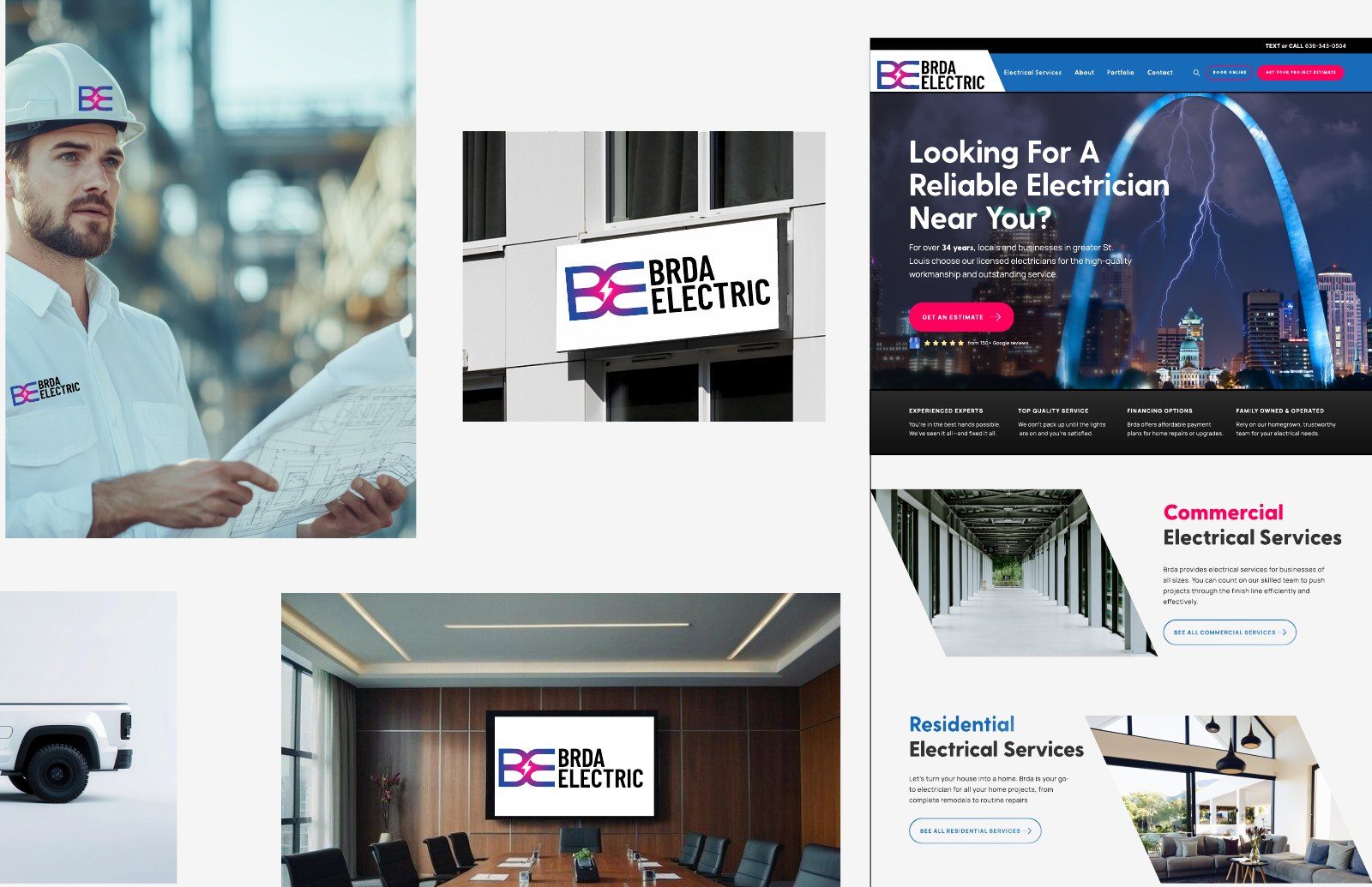 Brda Electric truck, signs and site
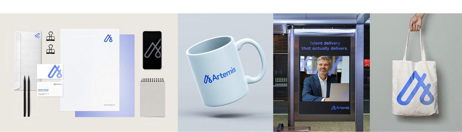 Artemis stationery and merch
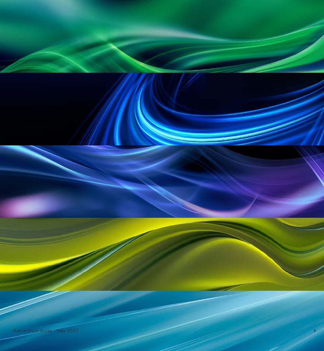 The Partner Masters backgrounds
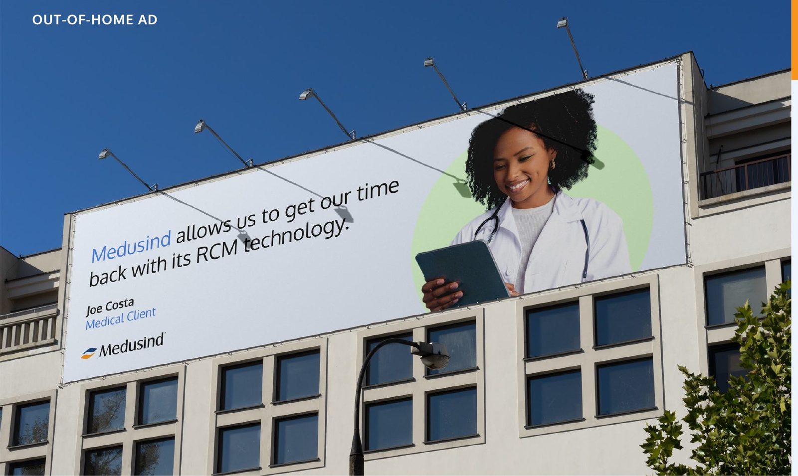 Medusind billboard
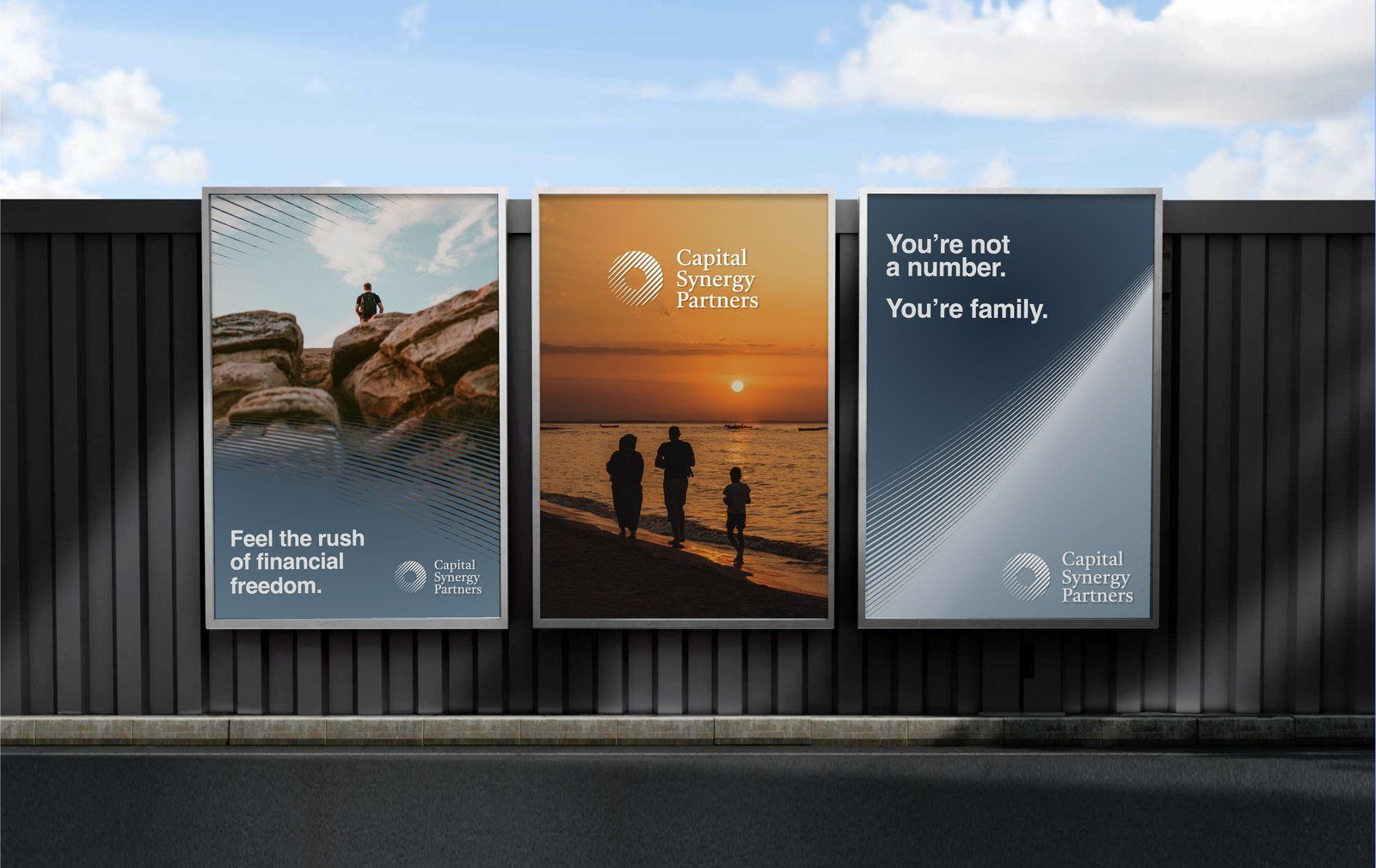
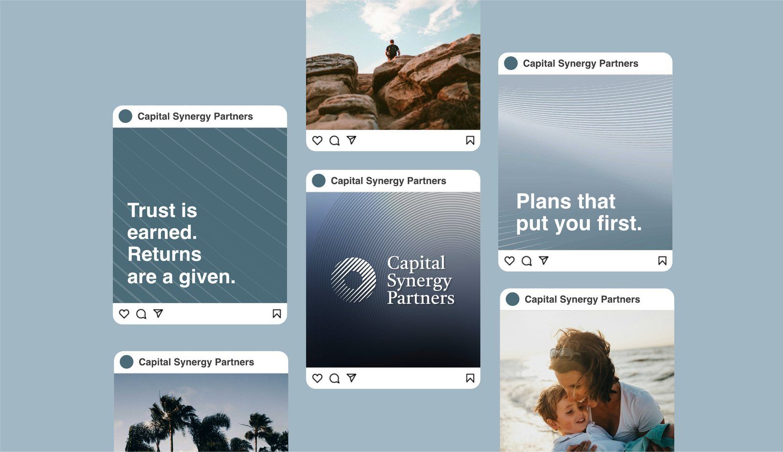
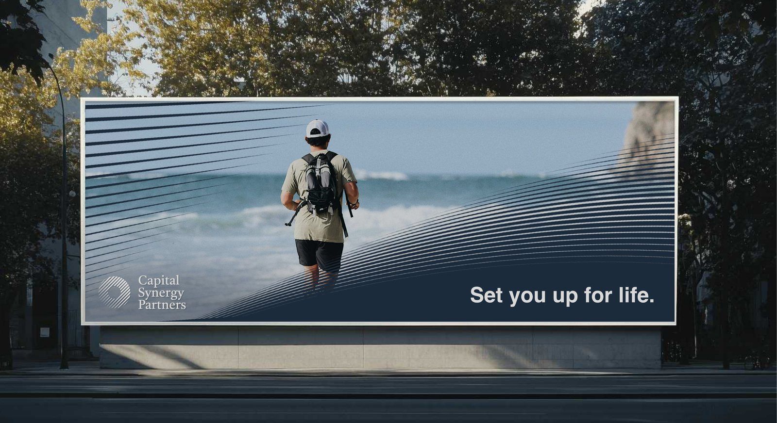 Capital Synergy Partners billboard
Six of the logos we've designed. Each one flips to show where it lives now.
People decide whether to trust a brand in the time it takes to scroll past it. We make that moment count, then make it repeatable on every product page, ad, box and email.
A brand built on a clear position stands apart from the category it competes in, so people notice it and remember it.
One system for every channel, product line and new market, so the brand looks and sounds the same no matter who on your team is using it.
A brand shapes performance as much as perception. We build brands that grow trust, loyalty and lifetime value, then measure them against those goals.
Strategy before design
Before any design starts, we sit down with your team and work through five big questions, using research and your own data to answer them. Keep scrolling to hear what we ask.
Who buys from you today, and who do you wish bought from you?
What were they doing right before they found you?
What almost stopped them from buying?
What do they say about you when you're not in the room?
Who else are your customers considering?
What does every brand in your category look and sound like?
What does everyone claim that nobody proves?
Where is the space nobody owns yet?
What do you do better than anyone, and can you prove it?
Why should a stranger believe you?
If you could only make one promise, what would it be?
What would your customers miss if you disappeared tomorrow?
If your brand were a person, how would they talk?
What should people feel in the first three seconds?
What would you never want to sound like?
Which brands outside your category do you admire, and why?
What does success look like a year after launch?
Which numbers should a stronger brand move?
Where are customers dropping off today?
How will we track it once the brand is live?
Our work
A logo is only the start. Scroll through each brand to watch it pull back into the full system, and see exactly which parts we made.
Porcelain & ceramic tile
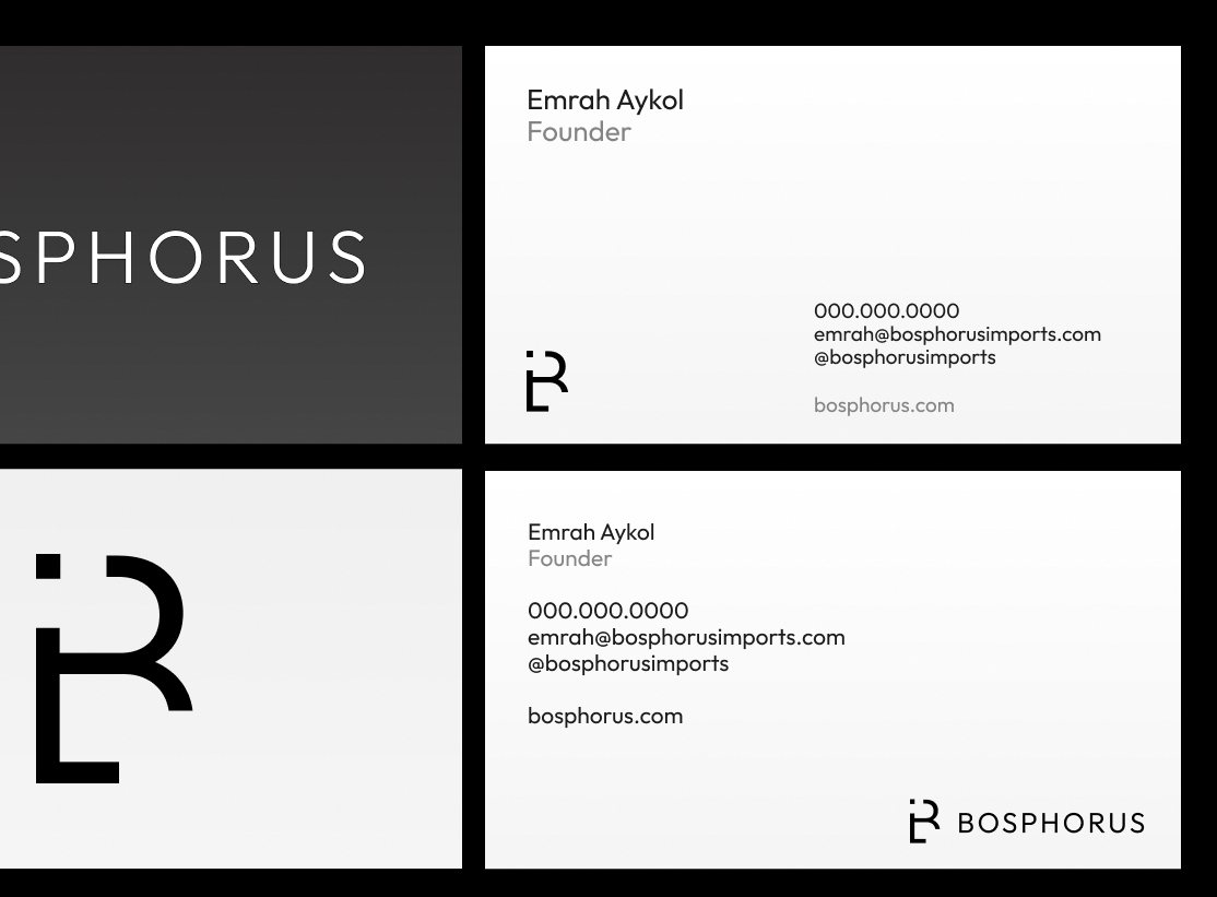
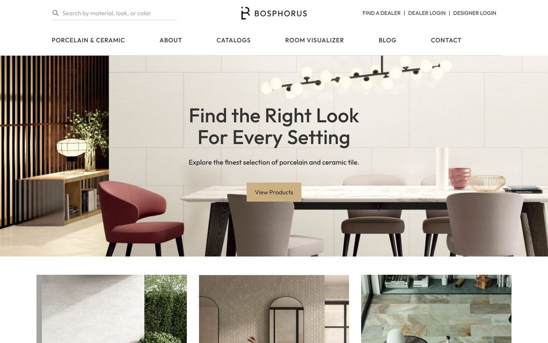
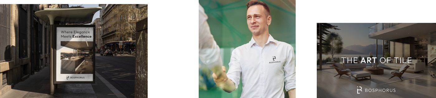
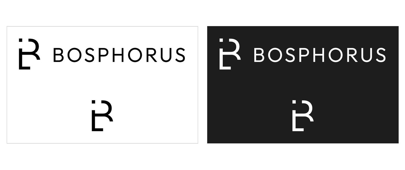
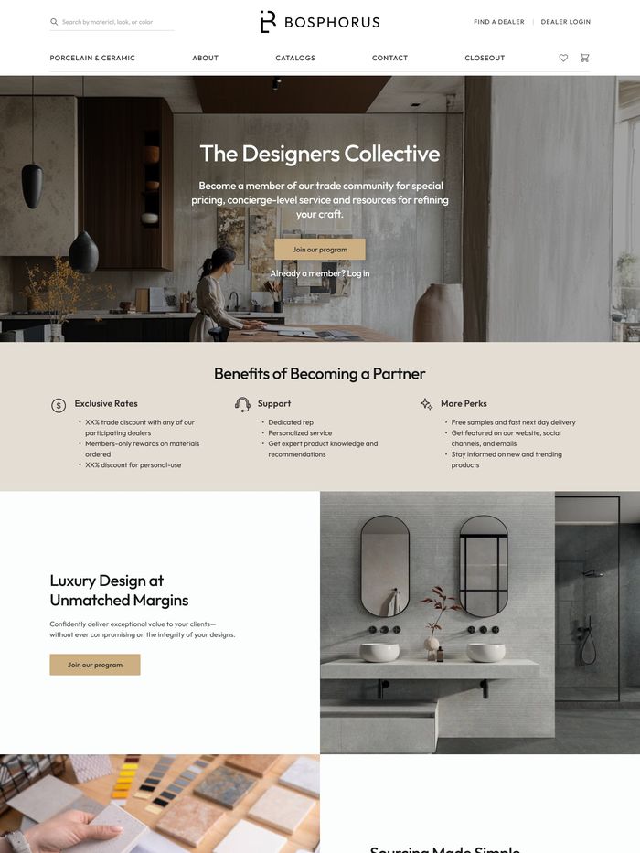
A tile importer selling to designers and homeowners. The identity is as quiet as the rooms the tile ends up in: a monogram that reads as both B and R and warm stone neutrals that let the surfaces do the talking.
Residential & commercial electrical
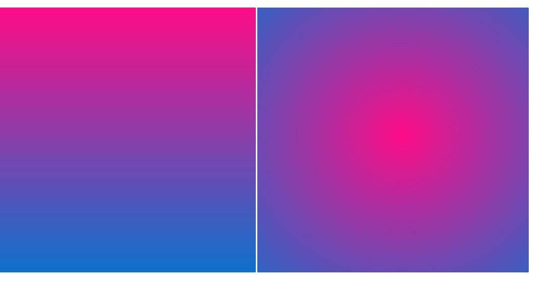
A St. Louis electrician with more than 30 years of service. We built its first identity in 2023 around the line “Let there be light,” then rebuilt it in 2025 for Tampa with a BE monogram that hides a lightning bolt and a blue-to-pink charge of color.

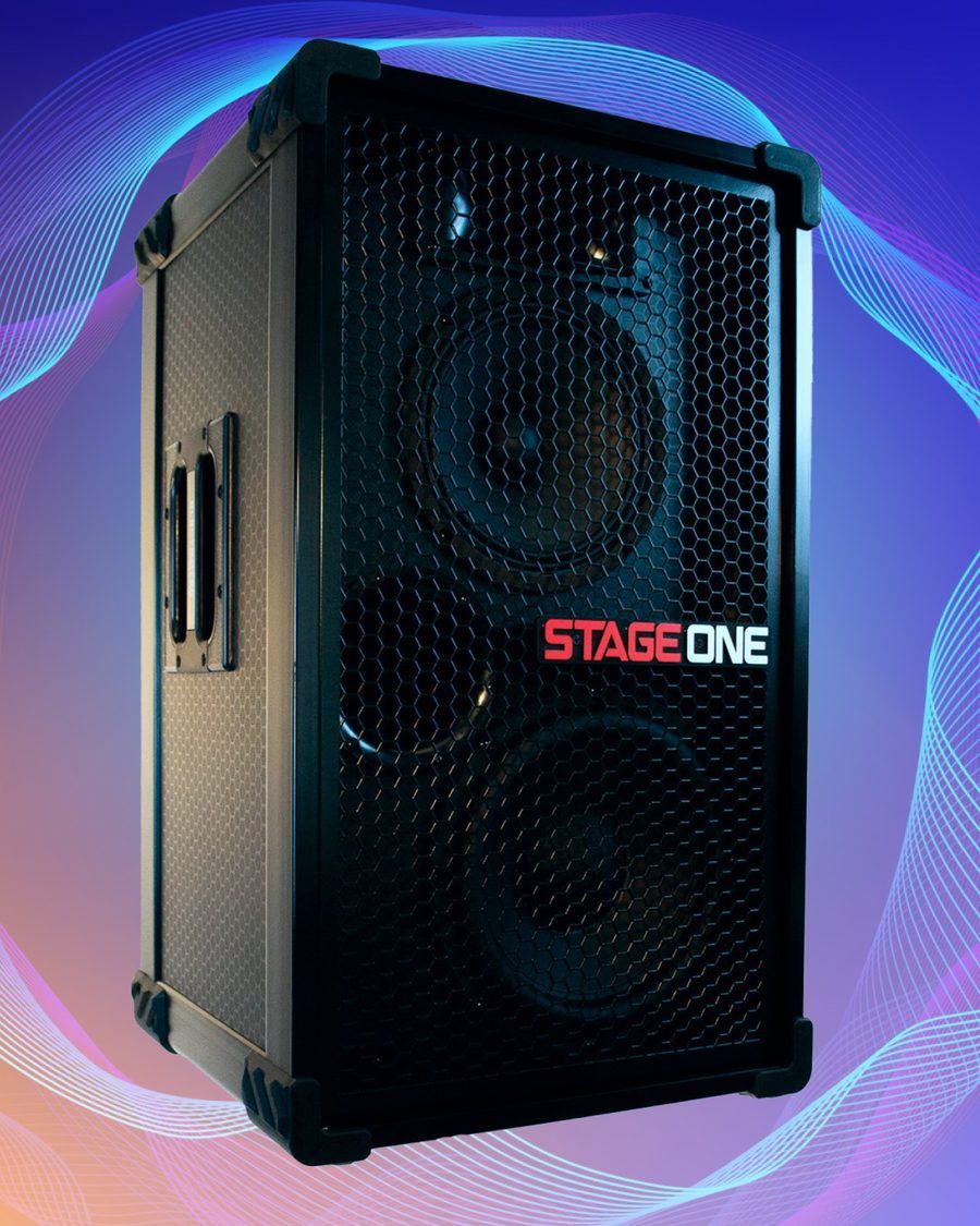
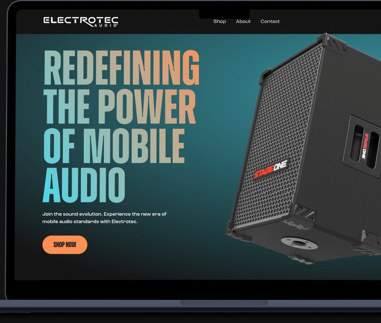
Portable speakers
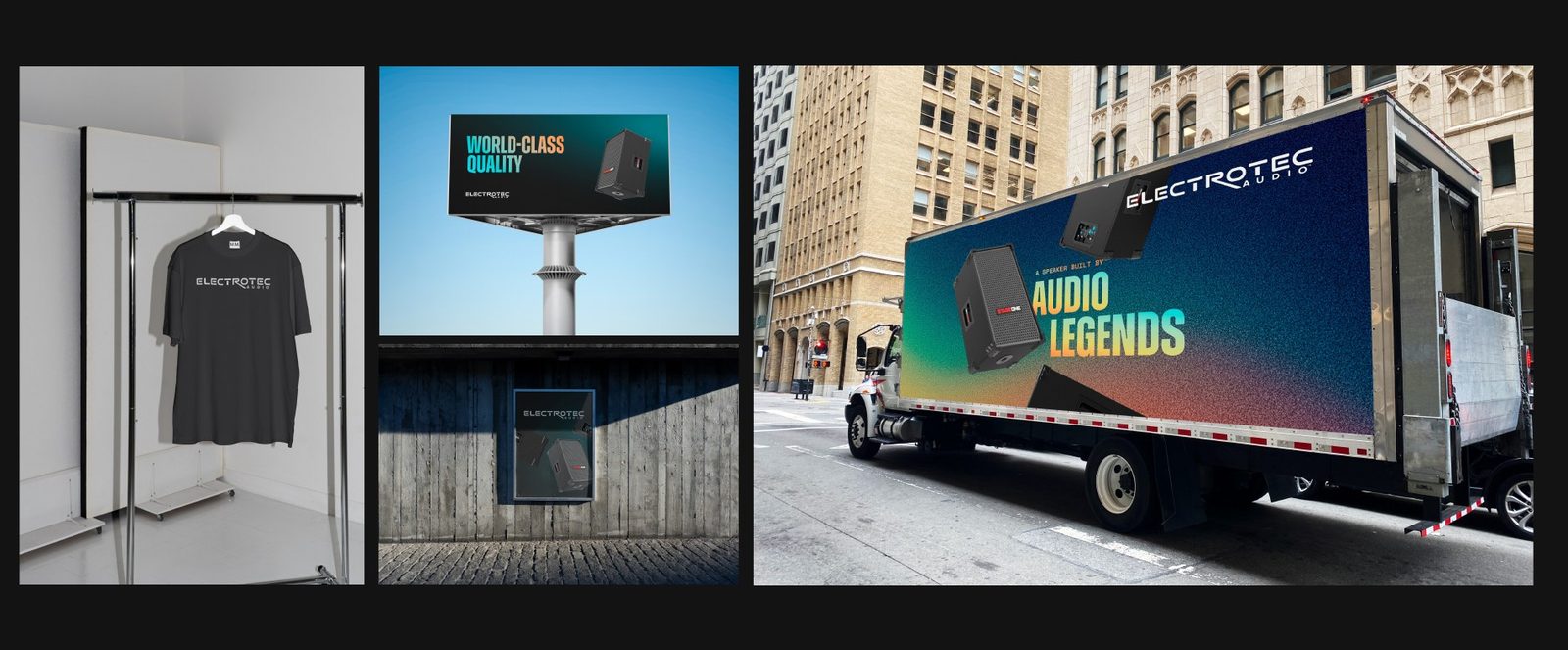
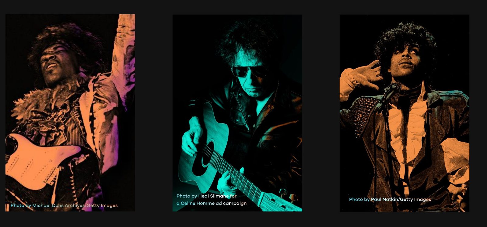
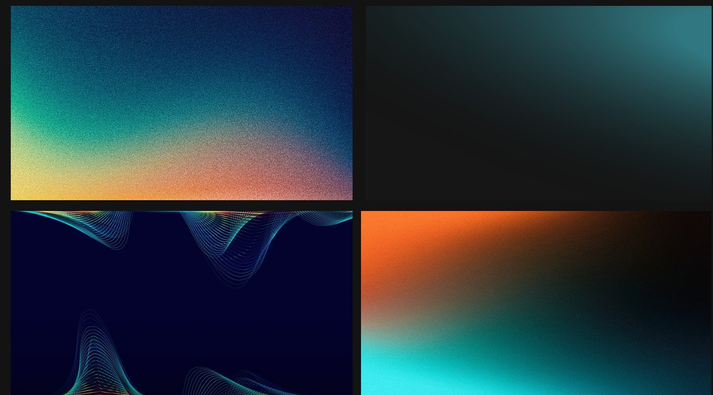
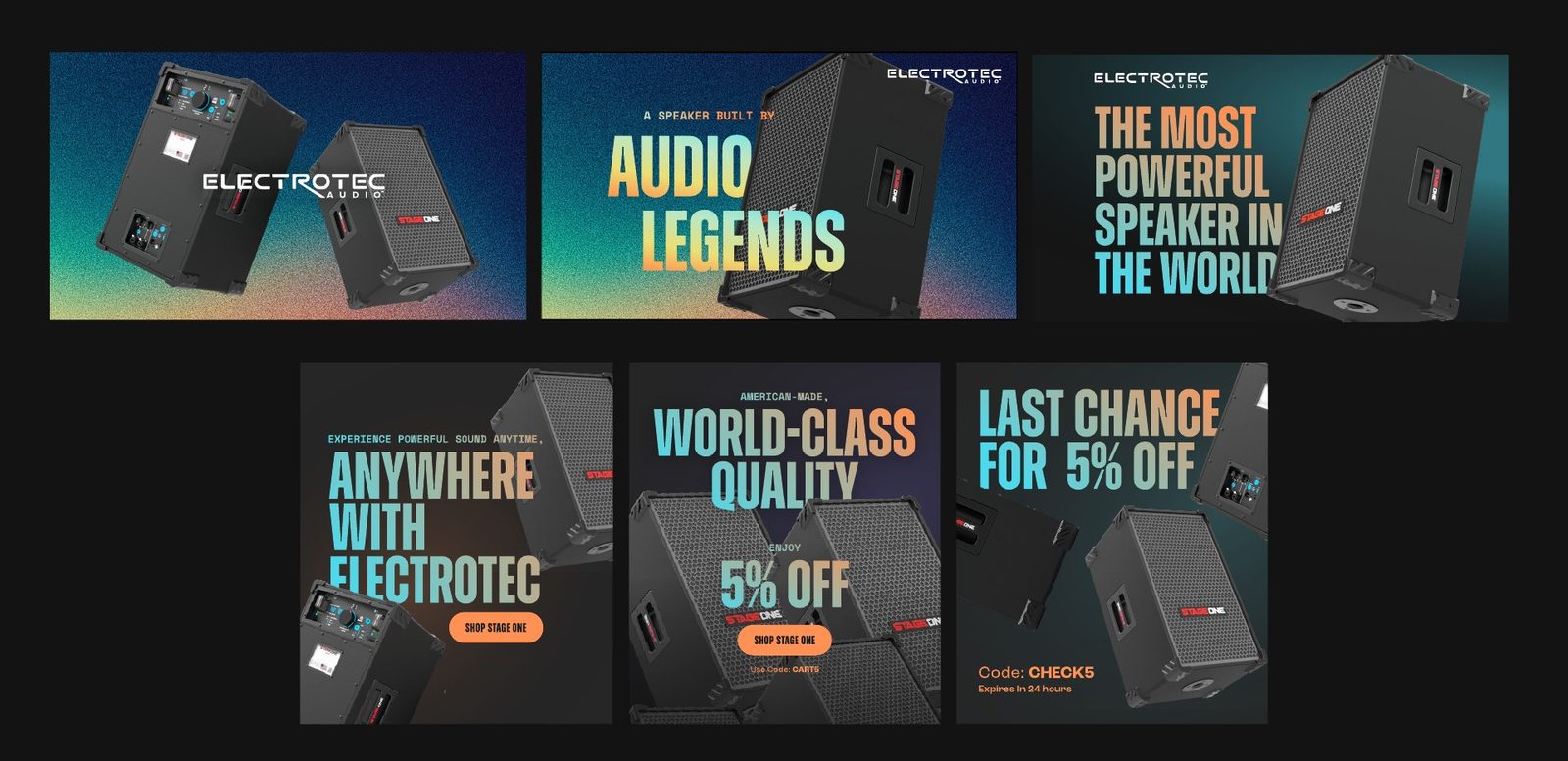
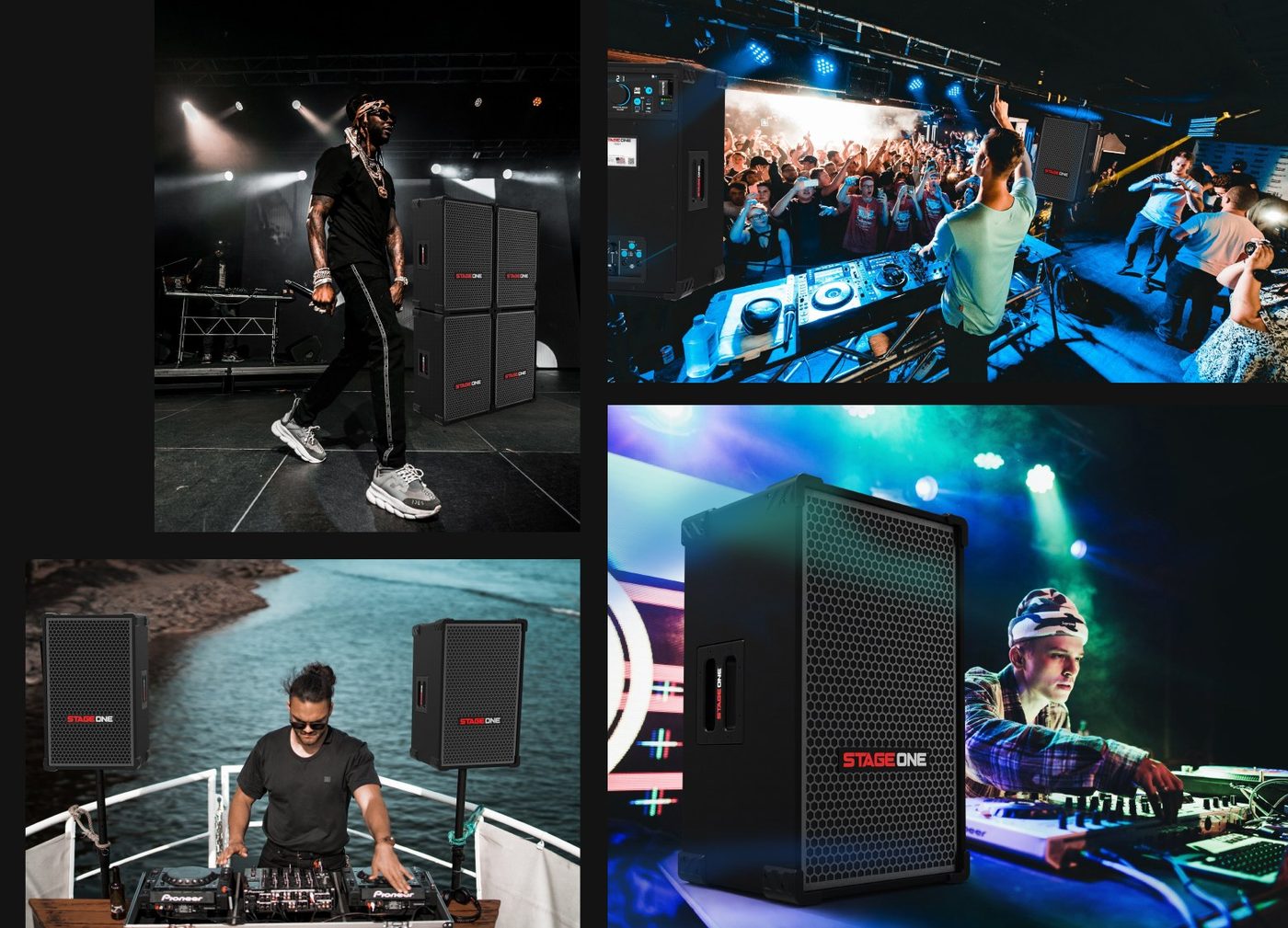
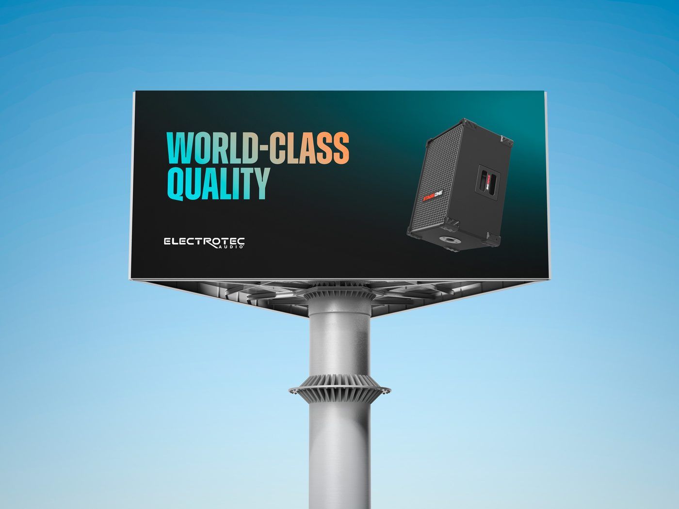
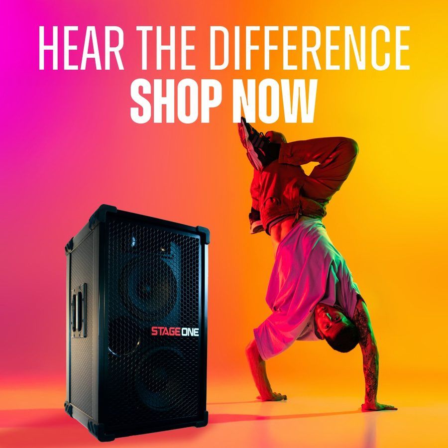
An American speaker company built by music people. We gave it a loud, stage-lit look: gradients pulled from concert lighting, bold type and photo direction made to work on a truck as well as a product page.
More brand work
Different industries need different brands. The work starts the same way every time, with what the brand has to make people feel.
See you at home.
Home furnishings
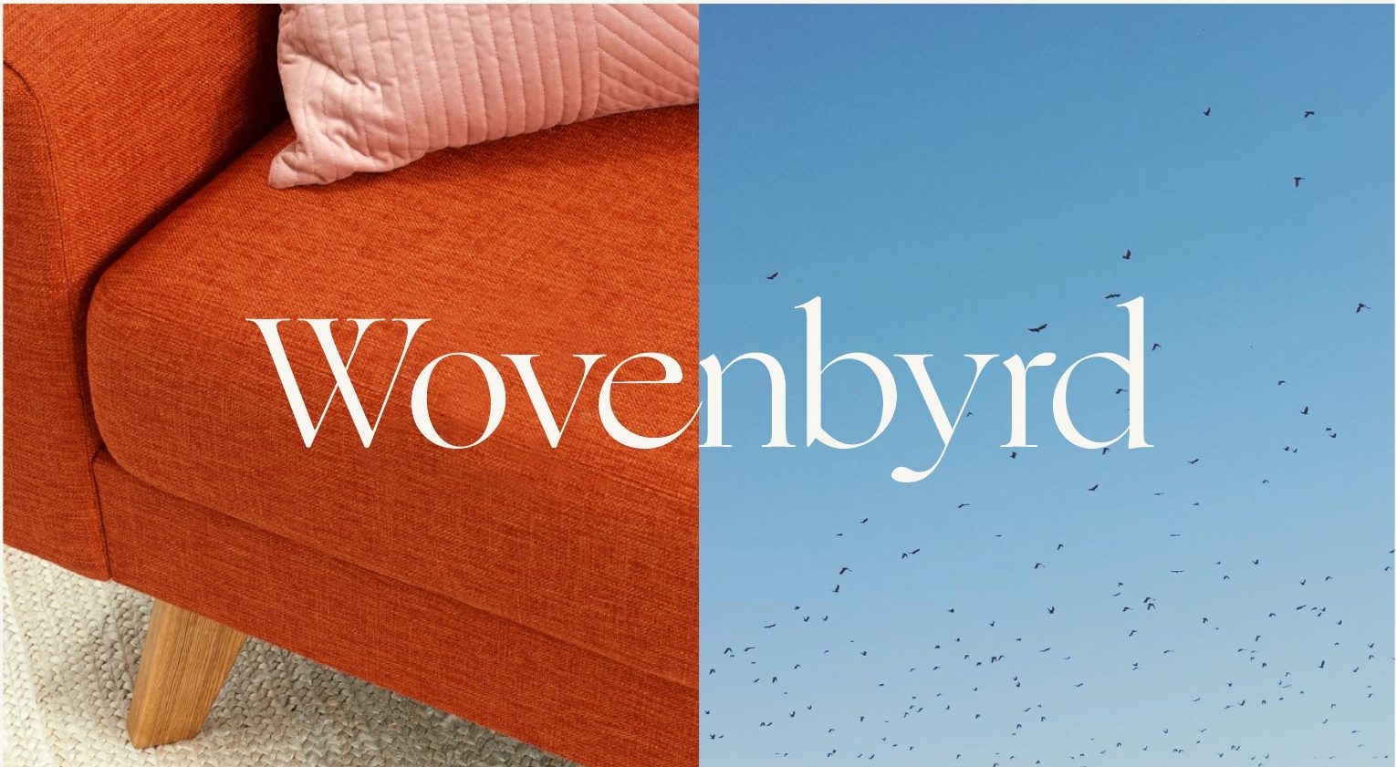
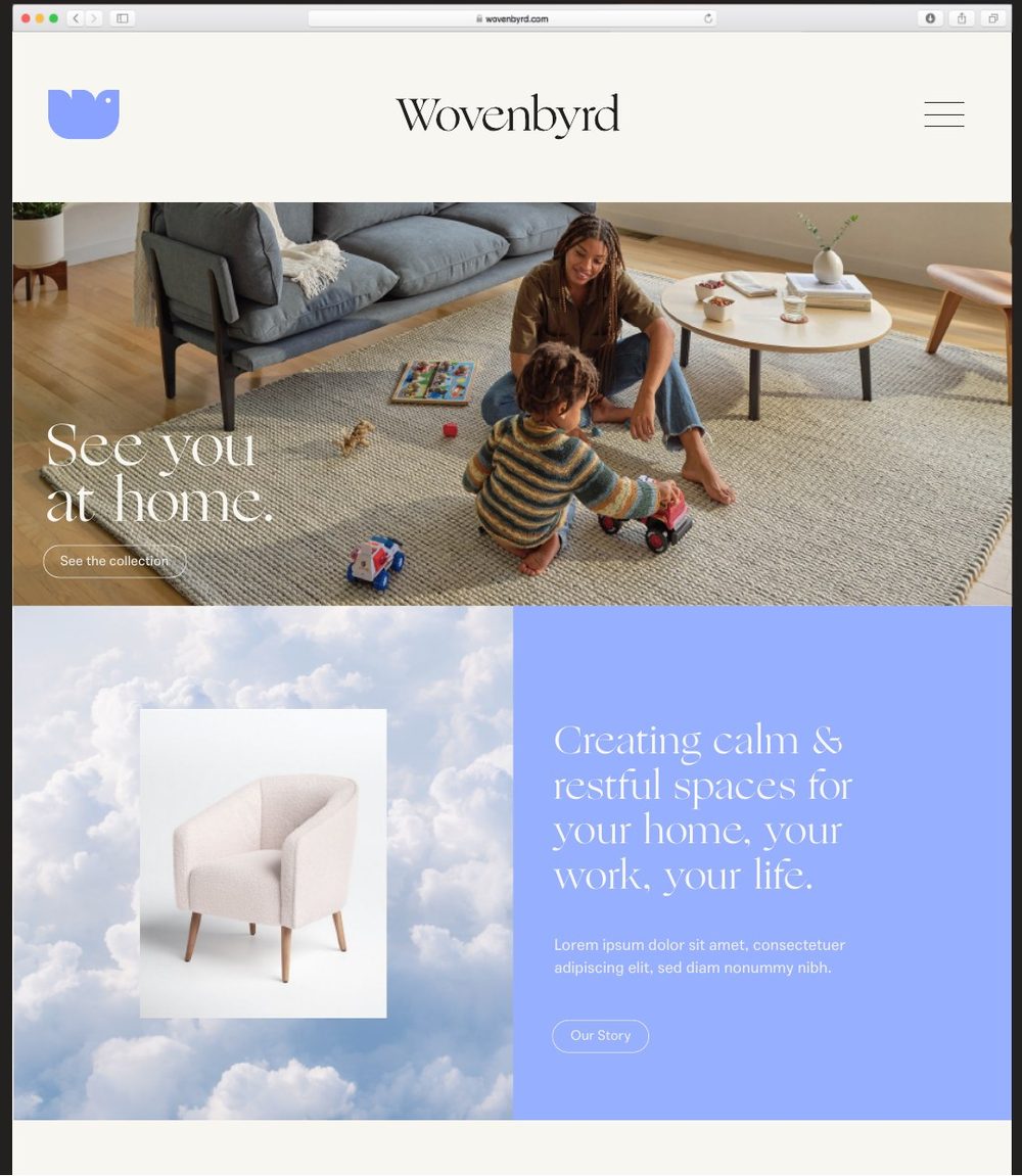
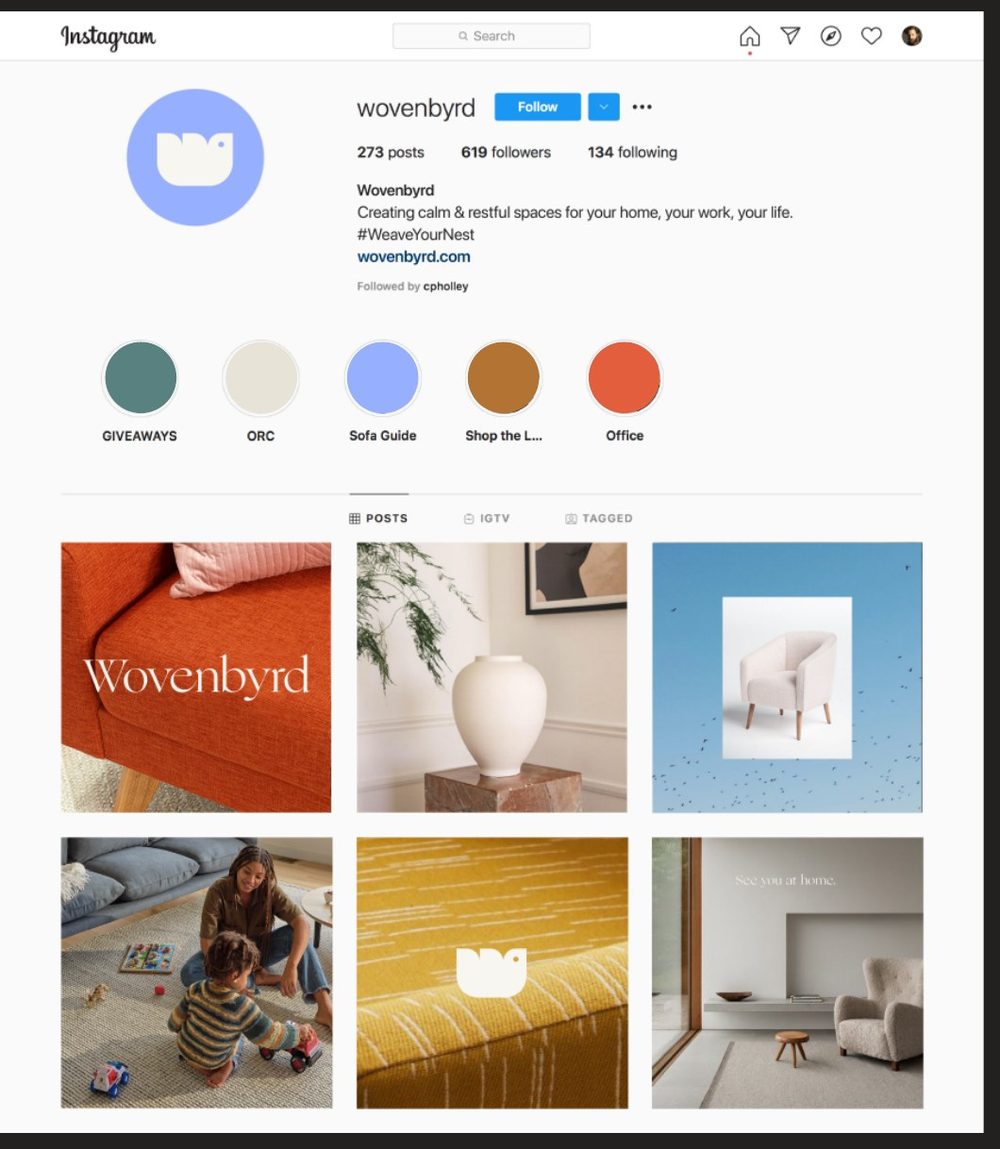
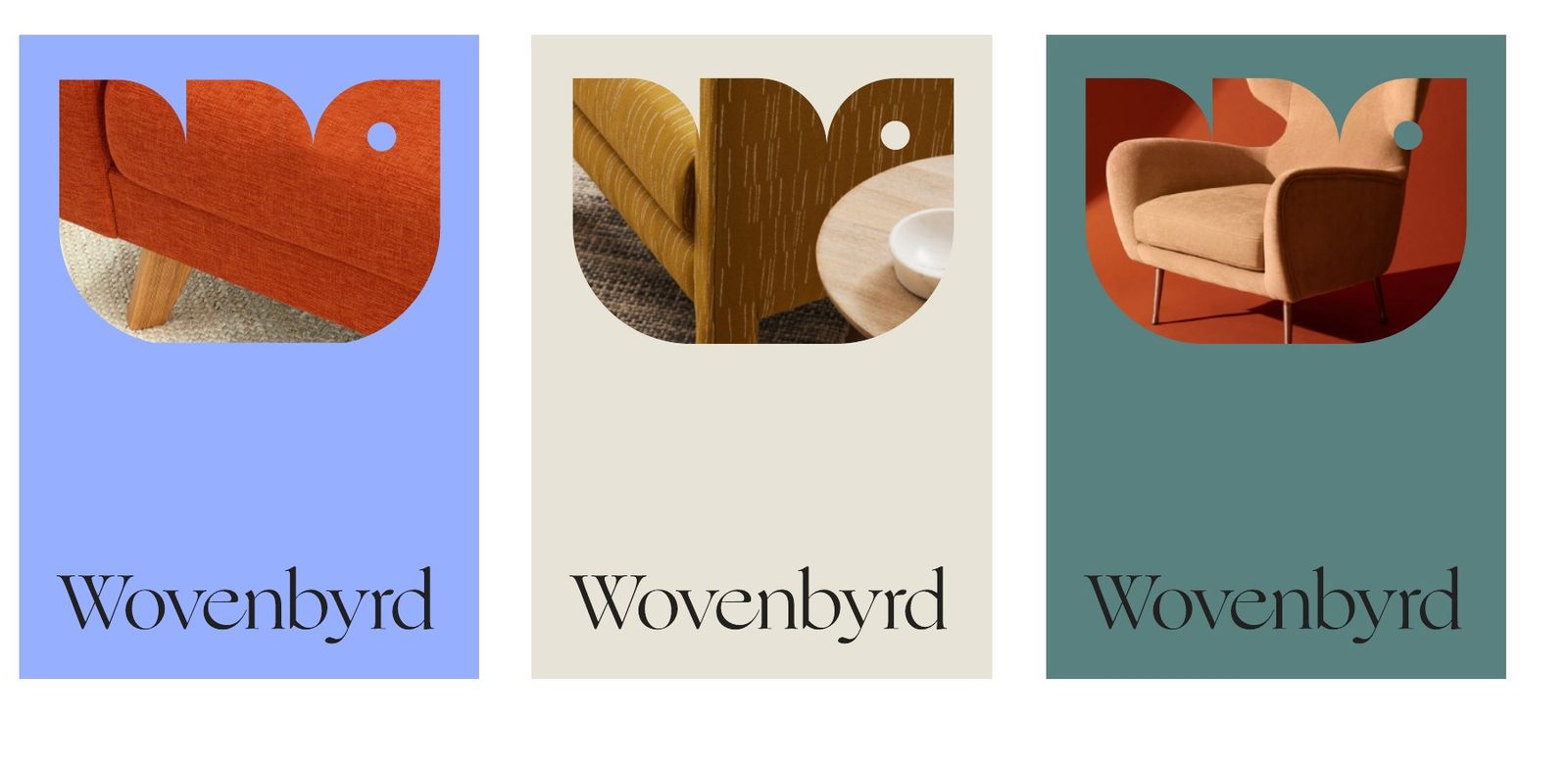
A furniture brand that wanted to feel like coming home. We built the strategy and voice around one idea, “See you at home,” and carried it through the brand's color, photo direction, social and website.
Talent & staffing
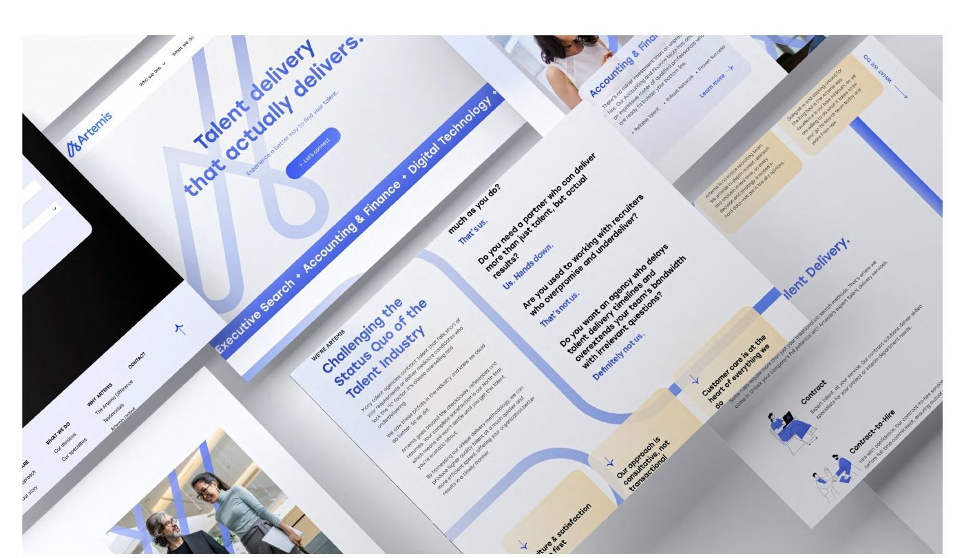
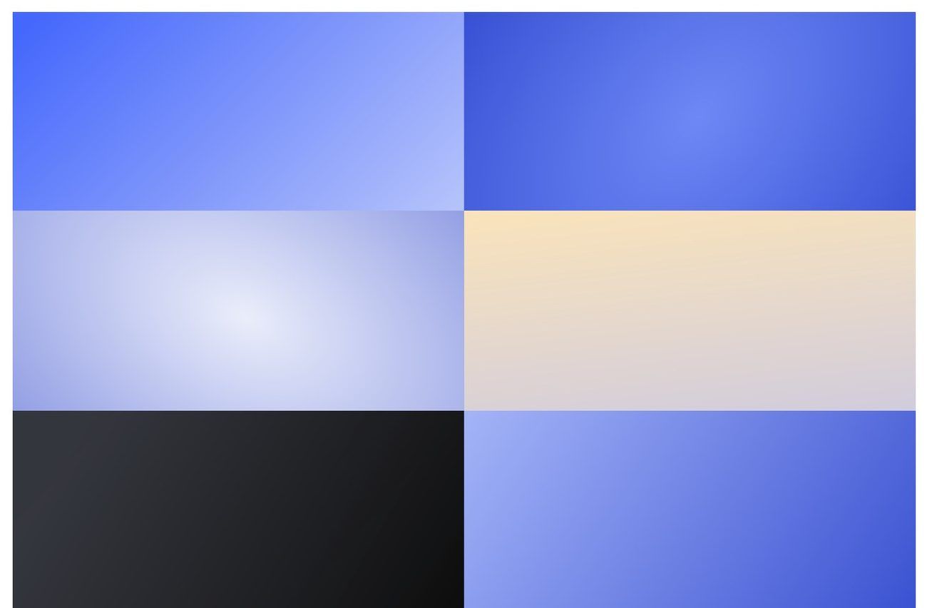
A talent company that leads with relationships. The mark turns the A into a single looping stroke, like a ripple spreading out, and the system stays bright and friendly in a category full of gray.
Microsoft partner advisory
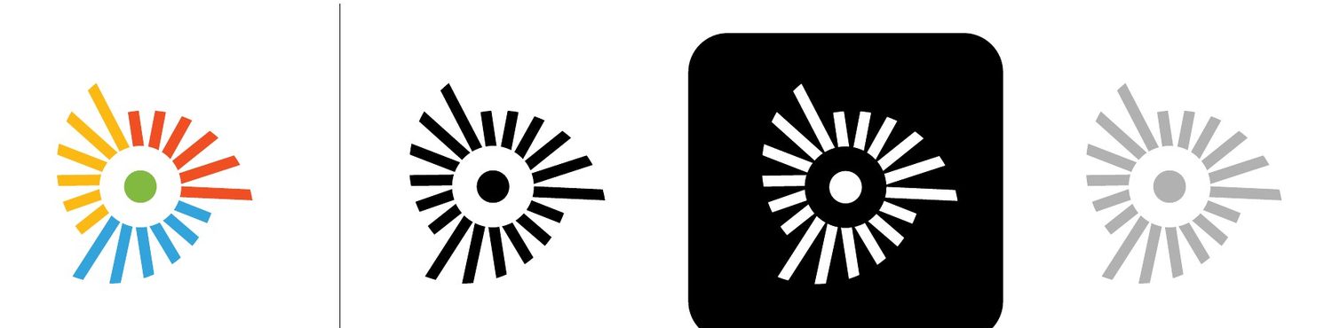
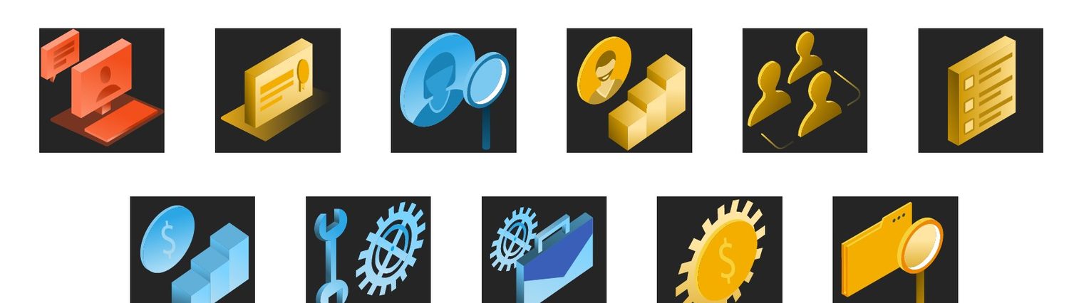
An advisory firm for Microsoft partners. The sunburst gathers four colors into one center point, a picture of many partners pulling in one direction, and the system builds on it with arcs, motion backgrounds and a 3D icon set.
RW Fine Jewelry
Fine jewelry
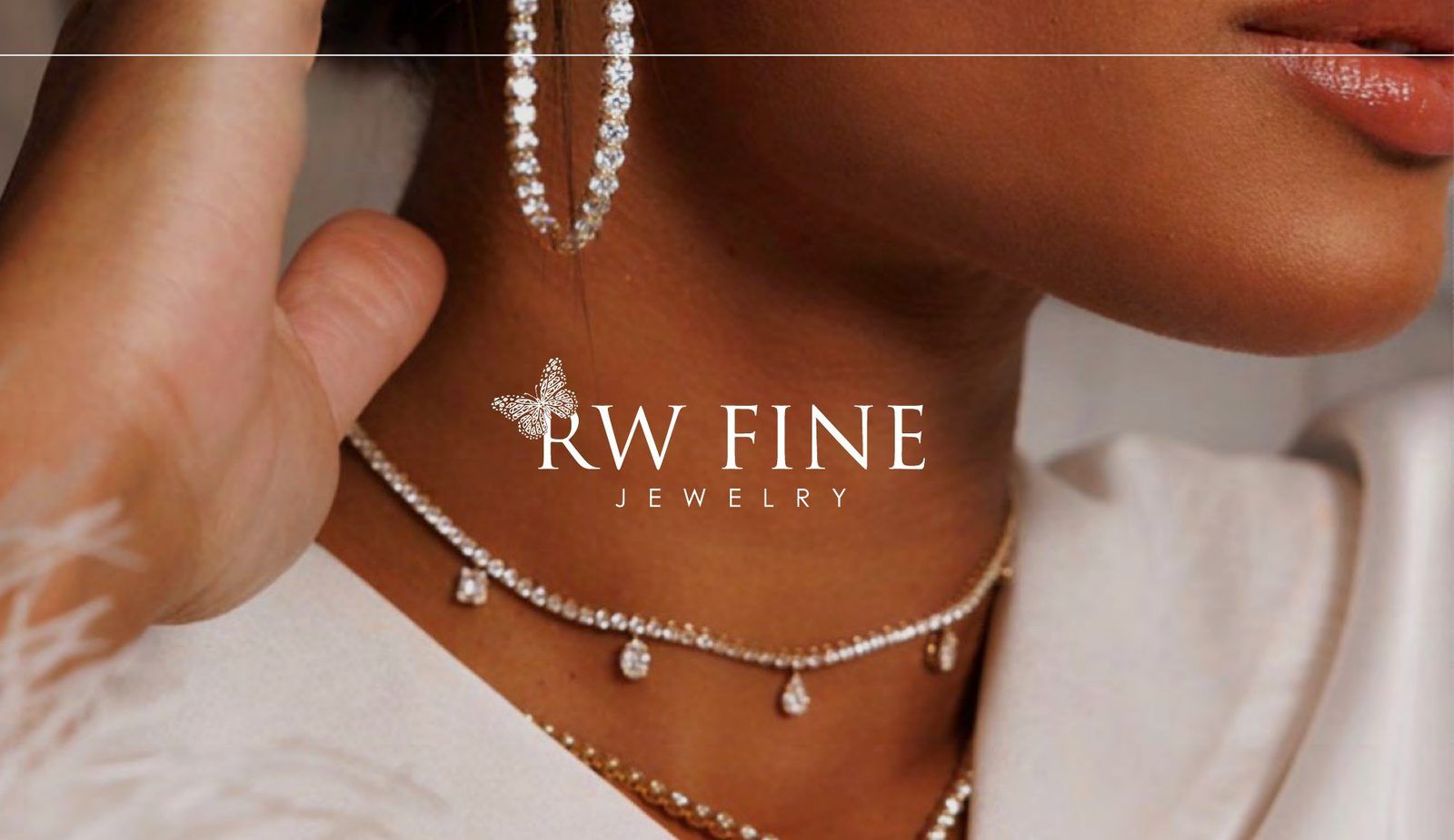
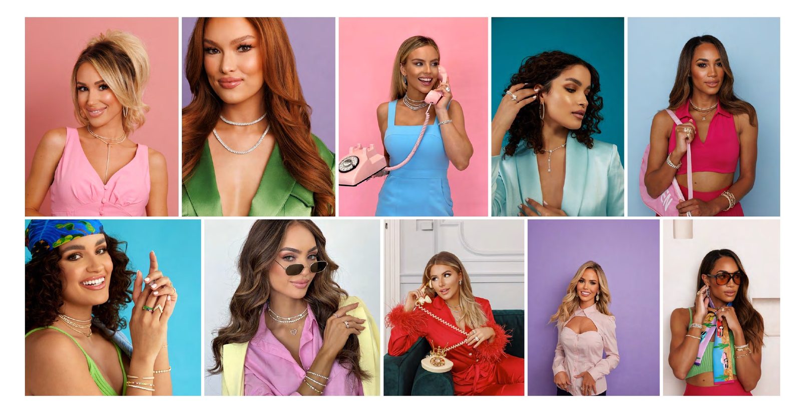
A jeweler known for its RingWraps. We set the brand's promise and voice, then chose soft ivory neutrals, fine type and illustration that keep the eye on the stones.
Healthcare revenue cycle
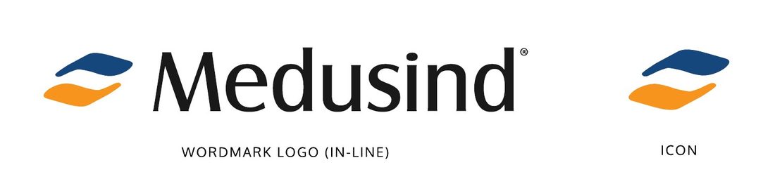
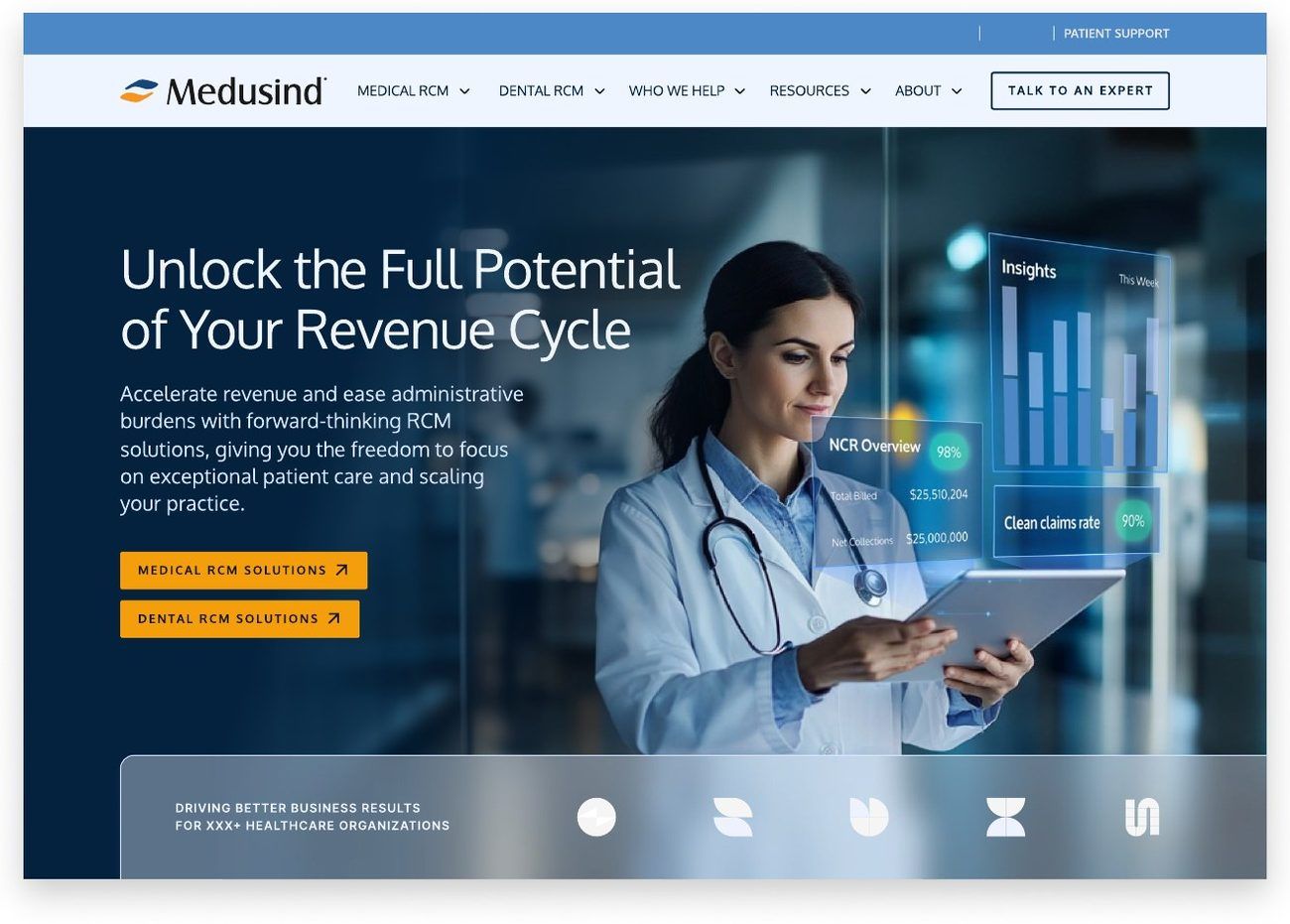
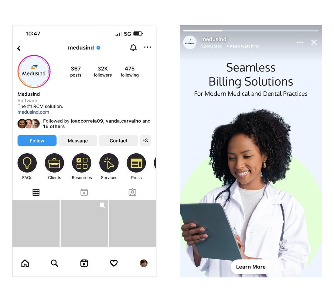
Billing and revenue cycle services for medical and dental practices. Two interlocking strokes, navy and orange, make a mark that feels steady and forward-moving, built to hold up from a billboard to an Instagram avatar.
Wealth management
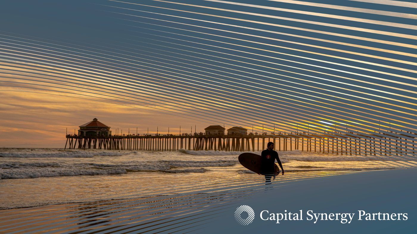
A Southern California wealth firm whose promise is “Backed by data, not incentives.” The identity pairs a radial mark of rising lines with a calm navy palette and photo direction built around the coast its clients live on, so financial planning feels personal instead of corporate.
Results
These clients changed how they look and sound with us, then carried it through their website, ads and email. Here is what moved.
We unified Softies' brand experience with fresh creative and design, taking it from an outdated site to a high-converting ecommerce presence.
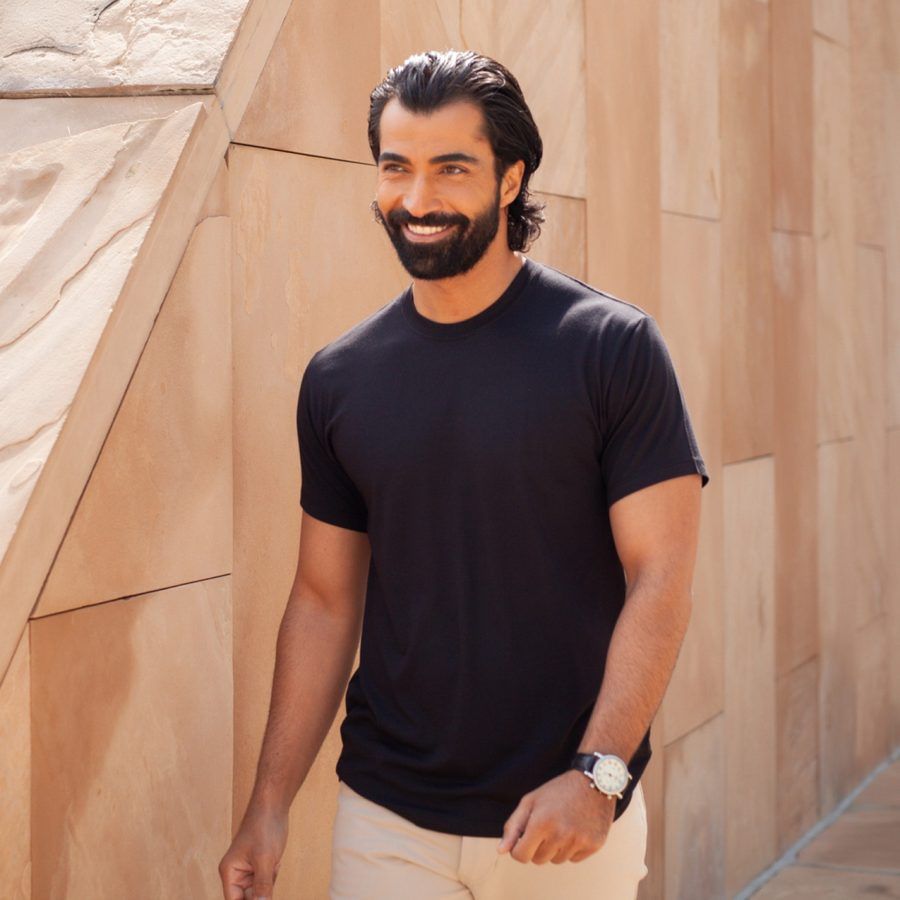
We expanded Thompson Tee's visual library, from product photography to social creative, so the brand told a stronger story in every campaign.

We gave FASTECH a clear, differentiated brand narrative for its clean energy work, then brought it to life in new messaging, content and a new website.
“What I like most about Human is that they have actual measurements they hold themselves accountable to every single month. From our very first meeting with Human, they had KPIs in place.”
A brand is one piece of a profitable marketing system. Because the same team runs your strategy, website, paid media, SEO and email, the brand is applied the same way everywhere and we can see how it performs in each channel.
See how The Human Method works →What you leave with
Hire us for the brand on its own, or have the same team carry it into your ads, emails and website afterward. Every project is scoped to what your brand needs.
Research into your customers and competitors, then your mission, promise, positioning and the people you are building for.
Value propositions, key messages and a voice guide with clear do's and don'ts your team and partners can write from.
When a company or product needs a new name: options built from the strategy, each with what it means and how it looks in use.
Primary and secondary logos, a symbol, color, type, icons and photo direction, with rules for space, size and misuse.
One guide that holds the strategy, voice and visual toolkit, plus every logo file and template your team will reach for.
How a project runs
We audit your current brand and study your market, competitors and customers to find where you can stand apart.
Positioning, promise, messaging and voice, plus the measurable goals the brand should move, all approved before design begins.
Distinct routes, each with type, color, logo exploration and the brand shown in use, judged against the strategy.
The chosen route, refined into a full system and brand book that holds up at every size and in every channel.
We roll the brand out across your site, ads, email and packaging, track it against the goals and refine what the data shows.
Questions
The team



Creative & Design
Our designers also make the ads, emails, landing pages and websites that put it to work, month after month.
Start with a conversation
Tell us what you sell and who you sell it to. We'll show you where we'd start.
Get Your Free ConsultationEvery brand shown is a real Human client, and each one lists exactly what we made. Some images are presentation mockups from the original brand projects.